Food is Red, but the Web is Blue – The Psychology Behind Logo Colors
According to food psychologists, red is often associated with energy and excitement, and eating red food can make people feel more alert and energized. Red is also considered to be an appetizing color and is used by many fast-food restaurants as their primary logo color. On the other hand, blue is seen as a color that conveys trustworthiness, progress, and innovation. This is why many businesses, such as tech companies, choose blue as their primary logo color.
The psychology behind color in food logos can be a powerful tool for businesses to use when trying to create a memorable and effective logo. Understanding which colors spark which emotions can give your company an advantage over its competitors and increase the effectiveness of your company’s branding. By understanding the psychology behind red and blue food logos, businesses can create logos that are more likely to stick in the minds of their customers and that are also more likely to be associated with positive emotions.
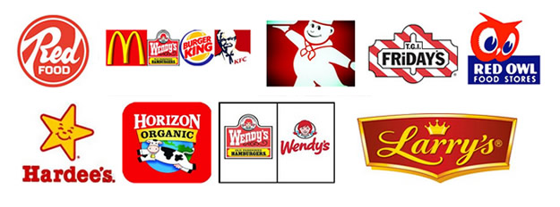
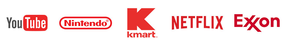
Below are other brands that use red as the predominant color in their logos.
The use of green in the logos of natural food brands is an important marketing strategy used to signify the healthful nature of their products. Green has long been associated with nature, health, and vitality, and using green in a logo can help to convey these sentiments to potential customers. Additionally, green is the color of money and growth, so using it in a logo can help to convey the message that the brand is a reliable and trustworthy source of healthy food.

Blue’s the king…
Blue dominates the web for most other companies. Companies often use blue in their logos because it is associated with trust, dependability, and strength. Blue is also one of the most popular colors, with 42% of men and 30% of women citing it as their favorite color. It is also thought to put people at ease, as it reminds them of the sky and the ocean. Many of the top brands use blue in their logos, such as HP, Phillips, and Samsung. Blue logos also create a sense of security and professionalism, making them appropriate for companies related to software, finance, the pharmaceutical industry, government, and banks.
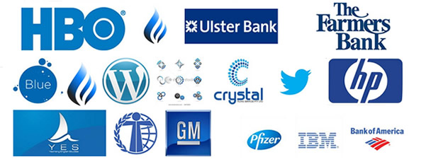
In other words, blue want leave you feelin’ blue.
Leave a Reply
You must be logged in to post a comment.